Asset Info Tab
Developer guide for the Asset Information form used on Assembly, Component, and Kit detail pages.
1. Screenshot
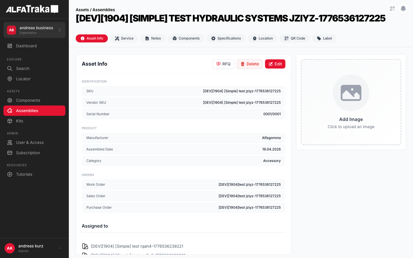
Live screenshot from dev environment (Assembly detail, Asset Info tab)
2. Component Tree
{AssetType} [id].tsx              pages/{assetType}s/[id].tsx
 |- PageHeader                    components/page-header/index.tsx
 |   |- breadcrumb: "Assets / {Type}s"
 |   '- title: asset.description
 |- AssetDetailTabs               components/asset-detail-tabs/index.tsx
 |   '- tab navigation (Info | Service | Notes | Components | Specifications | Location | QR Code | Label)
 '- AssetInformationForm          components/asset-information-form/index.tsx
     props: assetType, hideHeader=true
     '- AssetDetailLayout          components/asset-detail-layout/index.tsx
         props: hideHeader=true
         |- Card Header: "Asset Info" + [Edit] [Delete] [RFQ]
         |- LEFT (lg:w-2/3): FieldSections
         |   |- FieldSection "Identification"
         |   |   |- TableRow: Description   (description)
         |   |   |- TableRow: SKU           (customer_sku)
         |   |   |- TableRow: Vendor SKU    (sku)
         |   |   '- TableRow: Serial Number*(assembly only)
         |   |- FieldSection "Product"
         |   |   |- TableRow: Manufacturer* (assembly & component)
         |   |   |- TableRow: Category / Hub*(see per-type table)
         |   |   '- TableRow: Assembled Date*(assembly only)
         |   |- FieldSection "Orders"
         |   |   |- TableRow: Work Order*   (assembly only)
         |   |   |- TableRow: Sales Order*  (assembly & component)
         |   |   '- TableRow: Purchase Order*(assembly & component)
         |   |- FieldSection "Metadata"
         |   |   |- TableRow: Created       (read-only)
         |   |   '- TableRow: Last Modified (read-only)
         |   '- FieldSection "Assignments"* (if assigned_to exists)
         '- RIGHT (lg:w-1/3): AssetDetailsImage  (separate card)
                                   components/asset-details-image/index.tsx
* = conditional field; appears only for certain asset types or conditions. See table below.
Tab labels are: Info (always visible, default) | Service | Notes | Components | Specifications | Location | QR Code | Label. Visibility is controlled by assetType and permissions.
Per-Asset-Type Differences
| Field | Assembly | Component | Kit |
|---|---|---|---|
| Description | ✓ | ✓ | ✓ |
| SKU | ✓ | ✓ | ✓ |
| Vendor SKU | ✓ | ✓ | ✓ |
| Serial Number | ✓ | ☐ | ☐ |
| Manufacturer | ✓ | ✓ | ☐ |
| Hub | ☐ | ✓ | ☐ |
| Category | ✓ | ✓ | ✓ |
| Assembled Date | ✓ | ☐ | ☐ |
| Work Order | ✓ | ☐ | ☐ |
| Sales Order | ✓ | ✓ | ☐ |
| Purchase Order | ✓ | ✓ | ☐ |
| Created | ✓ | ✓ | ✓ |
| Last Modified | ✓ | ✓ | ✓ |
| Assignments | Shown if assigned_to exists (any type) | ||
3. Design Tokens
| Element | Tailwind Classes |
|---|---|
| Card container | rounded-lg border border-gray-200 bg-white |
| Card header | flex items-center justify-between border-b border-gray-100 px-5 py-4 |
| Card header title | text-lg font-bold text-gray-900 |
| Edit button | bg-ag_red hover:bg-ag_red/90 inline-flex items-center gap-1.5 rounded-lg px-3 py-1.5 text-sm font-medium text-white |
| Delete button | inline-flex items-center gap-1.5 rounded-lg border border-gray-200 bg-white px-3 py-1.5 text-sm font-medium text-red-600 shadow-sm hover:bg-red-50 |
| RFQ button | inline-flex items-center gap-1.5 rounded-lg border border-gray-200 bg-white px-3 py-1.5 text-sm font-medium text-gray-700 shadow-sm hover:bg-gray-50 |
| Field row (view) | flex items-center justify-between rounded-lg bg-gray-50 px-4 py-2.5Label: text-xs text-gray-600 Value: text-xs font-medium text-gray-900 |
| Field row (edit) | flex items-center justify-between rounded-lg border border-gray-200 bg-white px-4 py-2 |
| Section header | text-[10px] font-semibold uppercase tracking-wider text-gray-400 mb-2 |
| Height constraint | style="height: calc(100vh - 200px)" (applied when hideHeader=true) |
| Column split | Left: w-full lg:w-2/3 Right: w-full lg:w-1/3 |
| Save button (edit) | bg-ag_red rounded-lg px-4 py-1 text-white |
| Cancel button (edit) | rounded-lg bg-gray-200 px-4 py-1 text-gray-600 |
| Field section gap | space-y-6 between sections, space-y-1 between rows |
4. Data Fields
| Field Name | Type | Source Property | Editable | Condition | Asset Types |
|---|---|---|---|---|---|
| Description | TextInput / Textarea | description | is_custom only | -- | All |
| SKU | TextInput | customer_sku | Always | -- | All |
| Vendor SKU | TextInput | sku | is_custom only | -- | All |
| Serial Number | Read-only | serial_number | No | serial_number exists | Assembly |
| Manufacturer | ManufacturerSelect | manufacturer.name | is_custom only | is_custom OR user.type !== 'account' | Assembly, Component |
| Hub | Select | hub.slug | is_custom only | is_custom OR user.type !== 'account' | Component |
| Assembled Date | DatePicker | assembled_date | is_custom only | -- | Assembly |
| Category | Select / Creatable | category.name or .slug | is_custom only | Hose assemblies: disabled | All |
| Work Order | TextInput | work_order | is_custom only | -- | Assembly |
| Sales Order | TextInput | sales_order / sale_order | is_custom only | -- | Assembly, Component |
| Purchase Order | TextInput | purchase_order | is_custom only | -- | Assembly, Component |
| Created | Read-only | created_at | No | -- | All |
| Last Modified | Read-only | updated_at | No | -- | All |
Note: sales_order is used for assemblies; sale_order for components (different API shape).
5. Permissions
| Action | RIGHTKEY | Condition |
|---|---|---|
| View tab | -- | Always visible (first/default tab) |
| Edit asset | Manage{AssetType}ManageAssembly, ManageComponent, ManageKit | Button disabled without permission |
| Delete asset | Manage{AssetType} | asset.is_custom === true + confirmation modal. Button hidden for non-custom assets. |
| Request for Quotation | Request{AssetType}QuotationRequestAssemblyQuotation, RequestComponentQuotation, RequestKitQuotation | Button disabled without permission. Only shown when onRfqClick handler provided. |
| Save (edit mode) | Manage{AssetType} | Disabled if form has validation errors or save in progress |
Permission key is resolved dynamically via RIGHTKEYS[`${action}${typeMap[assetType]}`] in AssetDetailLayout.
6. Variants
Read-only field rows with gray background. Card header shows Edit, Delete (if custom), and RFQ buttons. Title clamped to 2 lines with "Show more" toggle.
Field rows switch to white background with border. Card header shows Save and Cancel buttons. Non-custom fields are disabled with bg-disabled text-disabled cursor-not-allowed styling. Description becomes a resizable textarea.
When asset.images is empty, AssetDetailsImage renders a placeholder with upload prompt (if manage permission).
Edit button still visible but most fields are disabled (disabled={!asset.is_custom}). Delete button is hidden entirely. Some fields (Manufacturer, Hub) hidden for account-type users on non-custom assets.
7. Status
8. Web Interactive Mockup
Interactive mockup with variant switcher. Uses exact Tailwind tokens from the Design Tokens table above.
Asset Info
Identification
Product
Orders
Metadata
Product Image
Asset Info
Identification
Product
Orders
Metadata
Product Image
9. Mobile Design (React Native)
Proposed native layout for the Asset Info tab. Same data model and permissions, adapted for single-column touch interaction.
Assemblies
Product Image
Identification
Product
Orders
Metadata
Mobile view mode -- same field sections, single-column scroll, image at top
Edit Asset Info
Product Image
Identification
Product
Orders
Metadata
Mobile edit mode -- fields become inputs, Save/Cancel replace Edit/Delete in header, tabs dimmed