Components Tab
Developer guide for the Assembly Components grid: tile/list view, ComponentCard, empty state, Add Component modal, and wizard lock.
1. Screenshot
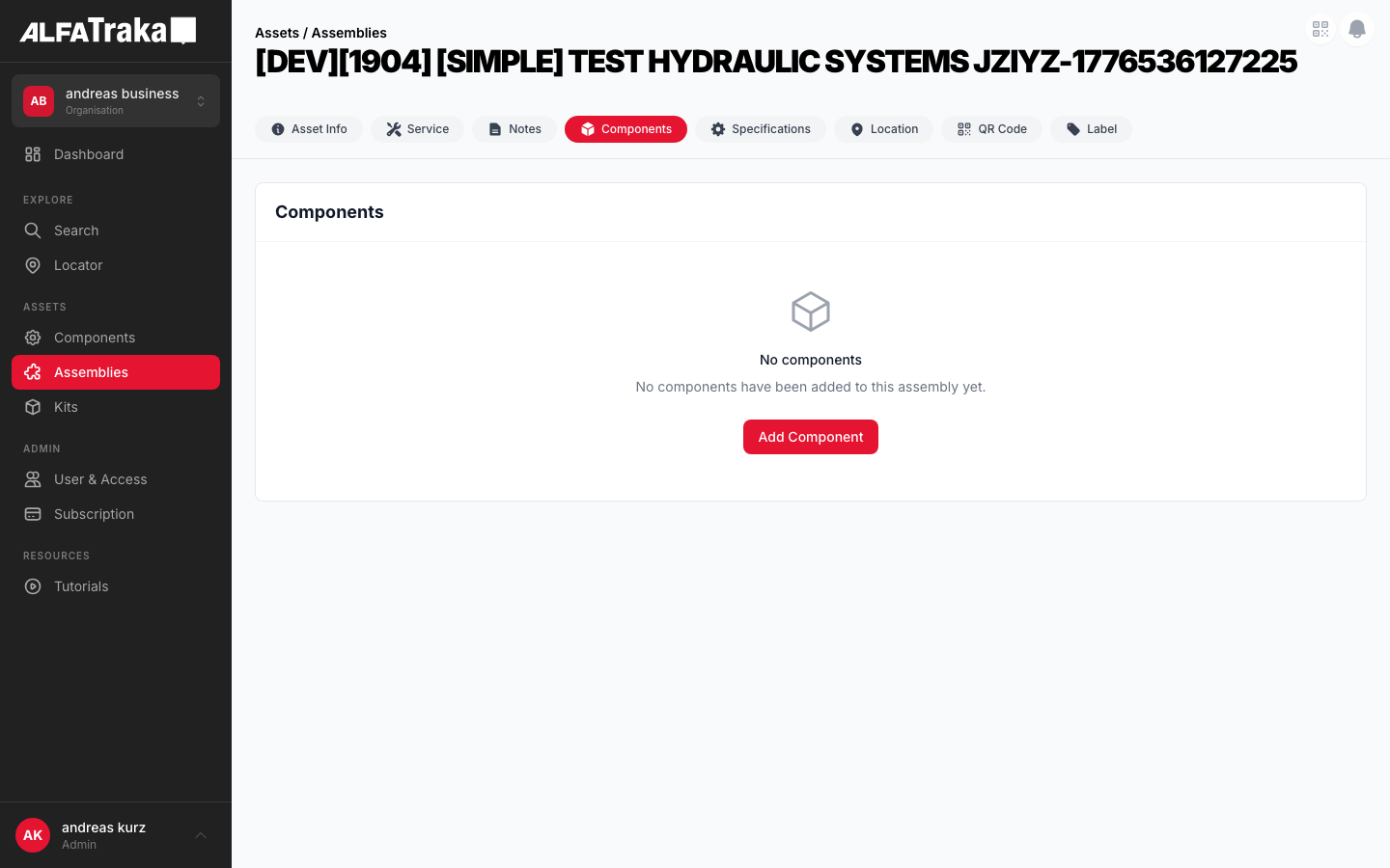
Live screenshot from dev environment (Assembly detail, Components tab)
2. Component Tree
AssetsAssembly                    components/assets-assembly/index.tsx
 |- viewMode state ('tile' | 'list')
 |- isWizardAssembly detection     (assembly.sides?.a || assembly.sides?.b)
 |- canEditComponents              (isEditComponentButtonVisible && !isWizardAssembly)
 |
 |- [hasComponents === false]
 |   '- EmptyState                components/empty-state/index.tsx
 |       props: cardTitle, icon (CubeIcon), title, description, actionLabel, onAction
 |
 |- [hasComponents === true && permissions.component.Manage]
 |   '- Card container           (rounded-lg border bg-white, maxHeight calc)
 |       |- Card Header
 |       |   |- title "Components"
 |       |   |- Smart Configurator badge  (if isWizardAssembly)
 |       |   |- Tiles/List toggle         (viewMode state)
 |       |   '- Edit Component button     (if canEditComponents, disabled check)
 |       '- ComponentGrid         smart-assembly-configurator/steps/components/ComponentGrid.tsx
 |           props: hideHeader, hideAvailability, controlledViewMode, readOnly
 |           |- [viewMode === 'tile']
 |           |   '- grid (1/2/3 cols)
 |           |       '- ComponentCard[]   smart-assembly-configurator/steps/components/ComponentCard.tsx
 |           |           props: component, onClick, isSelected, badges, hideAvailability
 |           |           |- image (h-28 bg-gray-50 rounded-lg)
 |           |           |- description (text-sm font-medium, line-clamp-2)
 |           |           |- SKU (text-xs text-gray-500)
 |           |           |- category badge (bg-gray-100 text-[10px])
 |           |           '- manufacturer badge (when hideAvailability)
 |           '- [viewMode === 'list']
 |               '- ComponentListTable    (table with Description, SKU, Manufacturer, Category)
 |
 '- AddComponentModel             components/add-component-modal/index.tsx
     props: user, permissions, isOpen, assembly, components, handleOpenQrModal
     |- Header "Add Component"
     |- Filter bar: QR scan, search, category select, manufacturer select, sort, view toggle
     |- Content: ComponentCardModal[] (tile) or table (list)
     |- Selected chips bar
     '- Footer: Cancel + Save
3. Design Tokens
| Element | Tailwind Classes |
|---|---|
| Card container | rounded-lg border border-gray-200 bg-whitemaxHeight: calc(100vh - 200px) |
| Card header | flex items-center justify-between border-b border-gray-100 px-5 py-4 |
| ComponentCard (default) | rounded-xl border-2 border-gray-200 p-4 hover:border-ag_red hover:shadow-md |
| ComponentCard (selected) | border-ag_red bg-red-50/30 ring-2 ring-ag_red/20 |
| Card image area | h-28 bg-gray-50 rounded-lg flex items-center justify-center overflow-hidden |
| Category badge | rounded bg-gray-100 px-1.5 py-0.5 text-[10px] font-medium text-gray-600 |
| Smart Configurator badge | rounded bg-blue-50 px-2 py-0.5 text-[10px] font-medium text-blue-600 |
| Manufacturer badge | rounded bg-gray-100 px-1.5 py-0.5 text-[10px] font-medium text-gray-600 |
| Tiles/List toggle | inline-flex h-9 items-center overflow-hidden rounded-lg border border-gray-200Active: bg-ag_red text-white Inactive: bg-white text-gray-600 hover:bg-gray-50 |
| Edit Component button | bg-ag_red hover:bg-ag_red/90 rounded-lg px-4 py-1.5 text-sm font-medium text-white disabled:opacity-50 |
| Grid layout | grid grid-cols-1 gap-3 sm:grid-cols-2 lg:grid-cols-3 |
| List table header | bg-gray-50 text-[11px] uppercase tracking-wide text-gray-500 |
| List table row (hover) | cursor-pointer border-t border-gray-100 transition hover:bg-red-50/40 |
| Empty state (grid) | h-48 rounded-xl border-2 border-dashed border-gray-200 bg-gray-50 |
| Empty state (card) | rounded-lg border border-gray-200 bg-white with centered icon + text + optional action button |
4. Data Fields
| Field | Type | Source Property | Display | Notes |
|---|---|---|---|---|
| component_id | string | c._id | Navigation target | Mapped to CrimpMatchFerrule.component_id; click navigates to /dashboard/component/{id} |
| description | string | c.description || c.customer_sku || c.sku | Card title (uppercased) | Fallback chain: description → customer_sku → sku → component_id |
| sku | string | c.sku || c.customer_sku || c.ag_code | Subtitle line | Displayed uppercased, shows "—" if all null |
| manufacturer | object | c.manufacturer.name | Badge (when hideAvailability) | Shown as gray badge on detail view; shown as table column in list view |
| hub | object | c.hub.name | Category badge | Maps to "Hose", "Ferrule", "Fitting", "Clamp" via HUB_CATEGORIES lookup |
| images | string[] | c.images[].url | Card image | First image used; camera SVG placeholder on error/missing |
| category | object | c.category.name | List table column | Fallback: hub.name || category.name |
| available_count | number | c.available_count | Hidden on detail | Hidden via hideAvailability prop; shown in wizard/configurator context |
Assembly components are mapped from their raw shape to CrimpMatchFerrule in AssetsAssembly via gridComponents useMemo.
5. Business Rules
| Rule | Details | Status |
|---|---|---|
| One hose per assembly | Only one hose component is allowed per assembly. The system should enforce this constraint. | ACTIVE |
| Hose restriction (remove from results) | When a hose is selected, all other hose-hub items are REMOVED from the search results (not disabled, not visible). Cleaner than graying out -- hoses consume a lot of space. | PROPOSED |
| Add Component 3-step flow |
Step 1: Select Hose (single select, filtered to hub_id=192 only). After selection, hoses are removed from all subsequent steps.Step 2: Select Side A components (ferrules, fittings, clamps -- multi-select). Step 3: Select Side B components (same pool, can select same items as Side A). This allows the same ferrule on both sides. Current modal is single-step free-form. | PROPOSED |
| Duplicate handling (Side A + Side B) | Same component on both sides is handled by the 3-step flow (Side A + Side B are separate selections). Each side's selections become separate component entries on the assembly. | PROPOSED |
| Side labels (future) | Future enhancement: add Side A / Side B labels to distinguish duplicate component entries that exist on both sides of the assembly. | FUTURE |
| No grouping or quantity | Each component entry represents a physical instance. No grouping, collapsing, or quantity counters -- every entry is listed individually. | ACTIVE |
6. Permissions
| Action | Permission / Check | Behaviour |
|---|---|---|
| View component grid | permissions.component[RIGHTKEYS.Manage] | Entire card hidden if false; shows empty state if no components |
| Show Edit Component button | isEditComponentButtonVisible prop | Button rendered only when prop is true AND !isWizardAssembly |
| Enable Edit Component button | isEditComponentButtonEnabled prop | Button rendered but disabled with opacity-50 cursor-not-allowed |
| Wizard lock | assembly.sides?.a || assembly.sides?.b | When true: Edit Component button hidden, components are read-only. "Smart Configurator" badge shown in header. |
| Click component card | Always allowed | Navigates to /dashboard/component/{component_id} (read-only navigation) |
| Add Component modal: Save | AssemblyService.updateComponent | Sends { add_ids, remove_ids } to API; requires Manage permission server-side |
canEditComponents = isEditComponentButtonVisible && !isWizardAssembly -- wizard assemblies (built via Smart Configurator) lock the component list.
7. Variants
Responsive grid (1/2/3 columns). Each ComponentCard shows image, description, SKU, category badge, and manufacturer badge. Cards have rounded-xl border-2 styling with hover border color change to ag_red.
Compact table with columns: Description, SKU, Manufacturer, Category. Row hover highlights with bg-red-50/40. When hideAvailability is true, shows Manufacturer + Category columns instead of AG Code + Available.
EmptyState component renders inside a card with header. Shows CubeIcon, "No components" title, description text, and optional "Add Component" action button (only if canEditComponents).
The "Smart Configurator" badge means the assembly was created via the Smart Assembly Wizard (assembly.sides populated). Impact: components are LOCKED -- no Add / Edit / Remove buttons are shown. Component cards look identical to legacy assemblies; the only visual differences are the blue badge in the header and the absence of the "Edit Component" button. Clicking cards still navigates to the component detail page (read-only navigation).
The web mockup below shows two sub-variants side by side: "Legacy Assembly" (Edit button visible) and "Wizard Assembly" (badge shown, no Edit button).
Non-wizard assembly with edit permissions. No "Smart Configurator" badge. "Edit Component" button is visible and enabled. Clicking opens AddComponentModal for adding/removing components from the assembly.
Full-screen (7xl) modal via Popup. Portfolio API loads all components with facets. Client-side filter by keyword, category, manufacturer. Supports tile/list view toggle, QR scan button, multi-select with chip bar, and Save/Cancel footer.
8. Status
9. Web Mockup
Interactive variant switcher showing all component tab states.
Legacy Assembly
Wizard Assembly
Components
No components
No components have been added to this assembly yet.
PROPOSED -- 3-Step Add Component Flow (not yet implemented)
Step 1 -- Select Hose
Add Component
Showing 4 hoses (single select)
1" HYDRAULIC HOSE SAE 100R2AT
HYD-R2AT-1IN
3/4" HYDRAULIC HOSE SAE 100R1AT
HYD-R1AT-34
1/2" HYDRAULIC HOSE SAE 100R2AT
HYD-R2AT-12
Step 2 -- Side A Components
Add Component
Hoses removed from results -- hose already selected in Step 1.
Showing 24 products (no hoses) -- multi-select for Side A
INTERLOCK FERRULE R2AT 1"
FRL-IL-R2AT-1
MALE JIC 37 FITTING 1"
FIT-JIC-1-16
BOLT CLAMP 1"
CLP-BOLT-1
Step 3 -- Side B Components
Add Component
Same pool as Side A -- you can select the same items (e.g., same ferrule on both sides).
Showing 24 products (no hoses) -- multi-select for Side B
INTERLOCK FERRULE R2AT 1"
FRL-IL-R2AT-1
MALE JIC 37 FITTING 1"
FIT-JIC-1-16
FEMALE JIC SWIVEL FITTING
FIT-JICSW-1-16
10. Mobile Design (React Native)
All mobile variant mockups for the Components tab.
Assemblies
1" HYDRAULIC HOSE SAE 100R2AT
HYD-R2AT-1IN
INTERLOCK FERRULE FOR R2AT 1"
FRL-IL-R2AT-1
MALE JIC 37 FITTING 1" 16-16
FIT-JIC-1-16
Assemblies
New Assembly
No components
No components have been added to this assembly yet.
Assemblies
1" HYDRAULIC HOSE SAE 100R2AT
HYD-R2AT-1IN
INTERLOCK FERRULE FOR R2AT 1"
FRL-IL-R2AT-1
MALE JIC 37 FITTING 1" 16-16
FIT-JIC-1-16
Components locked -- created via wizard. No FAB button.
PROPOSED -- 3-Step Flow (full-screen modal)
Step 1: Select Hose
1" HYDRAULIC HOSE SAE 100R2AT
HYD-R2AT-1IN
3/4" HYDRAULIC HOSE SAE 100R1AT
HYD-R1AT-34
1/2" HYDRAULIC HOSE SAE 100R2AT
HYD-R2AT-12
Step 2: Side A
INTERLOCK FERRULE R2AT 1"
FRL-IL-R2AT-1
MALE JIC 37 FITTING 1"
FIT-JIC-1-16
BOLT CLAMP 1"
CLP-BOLT-1
Step 3: Side B
INTERLOCK FERRULE R2AT 1"
FRL-IL-R2AT-1
FEMALE JIC SWIVEL FITTING
FIT-JICSW-1-16
BOLT CLAMP 1"
CLP-BOLT-1