Label Tab
TODODeveloper guide for the Label management tab. Supports Bartender label templates, preview rendering, and print integration for Assembly, Component, and Kit detail pages.
1. Screenshot
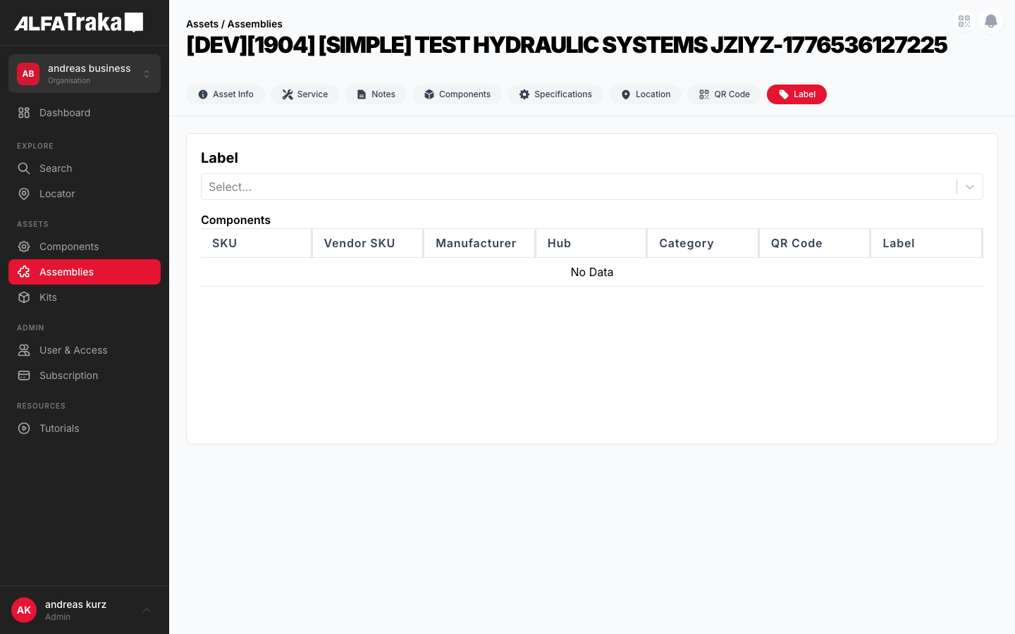
Live screenshot from dev environment (Label tab, current state)
2. Component Tree
Assembly [id].tsx                 pages/assemblies/[id].tsx
 |- AssetDetailTabs               components/asset-detail-tabs/index.tsx
 |   '- tab: "Label"
 '- LabelDetail                   components/label-detail/index.tsx
     props: asset, type, permissions, labels, setLabels,
            selectedLabel, setSelectedLabel, previewLabel,
            setPreviewLabel, bartenderLabel, setBartenderLabel
     |- Select (react-select)      label template dropdown
     |   '- options from labels[] array
     |- TableLite                  components/table-lite/index.tsx
     |   '- @tanstack/react-table columns
     |       |- Name column
     |       |- Description column
     |       '- Actions column (preview, print)
     |- LazyLoadImage              label preview image
     |   '- previewLabel.image (base64 or URL)
     |- UpdateAssemblyLabelModal   components/update-assembly-label-modal/index.tsx
     |   '- modal for label template assignment
     '- LabelService               @client/shared-layer
         |- .getLabels(assetType)
         |- .preview(labelId, assetId)
         '- .print(labelId, assetId)
3. Design Tokens
| Element | Tailwind Classes |
|---|---|
| Card container | rounded-lg border border-gray-200 bg-white |
| Card header | flex items-center justify-between border-b border-gray-100 px-5 py-4 |
| Card header title | text-lg font-bold text-gray-900 |
| Label select dropdown | react-select with custom styles (border-gray-200 rounded-lg) |
| Template list row | flex items-center justify-between px-4 py-3 border-b border-gray-50 hover:bg-gray-50 |
| Template name | text-sm font-medium text-gray-900 |
| Preview area | flex items-center justify-center bg-gray-50 rounded-lg p-6 min-h-[300px] |
| Preview image | max-w-full max-h-80 object-contain rounded border border-gray-100 |
| Print button | bg-ag_red hover:bg-ag_red/90 inline-flex items-center gap-1.5 rounded-lg px-3 py-1.5 text-sm font-medium text-white |
| Preview button | inline-flex items-center gap-1.5 rounded-lg border border-gray-200 bg-white px-3 py-1.5 text-sm font-medium text-gray-700 shadow-sm hover:bg-gray-50 |
| Tag icon | w-5 h-5 text-gray-400 (TagIcon from @heroicons/react) |
| Column split (proposed) | Left: w-full lg:w-1/3 Right: w-full lg:w-2/3 |
4. Data Fields
| Field Name | Type | Source Property | Editable | Notes |
|---|---|---|---|---|
| Label Template | Select (react-select) | labels[] | Selection only | Dropdown of available Bartender label templates |
| Selected Label | LabelEntity | selectedLabel | Via select | Currently selected template from dropdown |
| Preview Image | LazyLoadImage | previewLabel.image | No | Rendered preview from LabelService.preview() |
| Bartender Label | BartenderLabelEntity | bartenderLabel | Via modal | Updated through UpdateAssemblyLabelModal |
| Asset Type | String | type prop | No | 'assembly' | 'component' | 'kit' |
Label templates are fetched via LabelService.getLabels(assetType). Preview is rendered server-side by the Bartender integration.
5. Permissions
| Action | RIGHTKEY | Condition |
|---|---|---|
| View Label tab | -- | Always visible in tab bar |
| Preview label | -- | Label template selected |
| Print label | Manage{AssetType} | Label template selected + preview loaded |
| Update label assignment | Manage{AssetType} | Opens UpdateAssemblyLabelModal |
Permission key resolved via permissions prop passed from parent detail page.
6. Variants
Template list is populated from labels[]. User can select a template from the dropdown or table to load a preview. Print and preview actions are available.
When a template is selected, previewLabel.image is set and the preview area shows the rendered label image. The print button becomes enabled.
When labels[] is empty (no Bartender templates configured for the customer), an empty state with a TagIcon and message is shown.
The UpdateAssemblyLabelModal opens to allow changing the Bartender label template assigned to the asset. On save, bartenderLabel state is updated.
7. Status
8. Web Interactive Mockup
Left: current state with dropdown + table. Right: proposed redesign with template list panel + live preview.
Current Implementation
| Name | Description | Actions |
|---|---|---|
| Standard Asset Label (4x6) | Default label with QR code and asset info | PreviewPrint |
| Compact Asset Label (2x4) | Small format for tight spaces | PreviewPrint |
| Shelf Label (1x3) | Shelf-edge label with barcode | PreviewPrint |
Current: dropdown + full-width table, preview in separate area
Proposed Redesign
Standard Asset Label (4x6)
Default label with QR
Compact Asset Label (2x4)
Small format
Shelf Label (1x3)
Shelf-edge barcode
Warranty Card (A5)
Full warranty info
2" Gate Valve Assembly
SKU: GV-2IN-FLG-300
S/N: SN-2024-00847
Location
Warehouse A, Rack 12
Standard Asset Label (4x6) -- Preview
Proposed: template list LEFT, live preview RIGHT, print button in header
9. Mobile Design (React Native)
Scrollable template list with tap-to-preview. Print action at bottom.
Assemblies
2" Gate Valve Assy
2" Gate Valve Assembly
SKU: GV-2IN-FLG-300
SN-2024-00847
Standard Asset Label (4x6)
Templates
Standard Asset Label (4x6)
Default label with QR
Compact Asset Label (2x4)
Small format
Shelf Label (1x3)
Shelf-edge barcode
Scrollable template list with tap-to-preview, fixed print action at bottom