Notes Tab
Developer guide for the shared Notes tab used on Assembly, Component, and Kit detail pages. Chat-style note list with attachment preview panel.
1. Screenshot
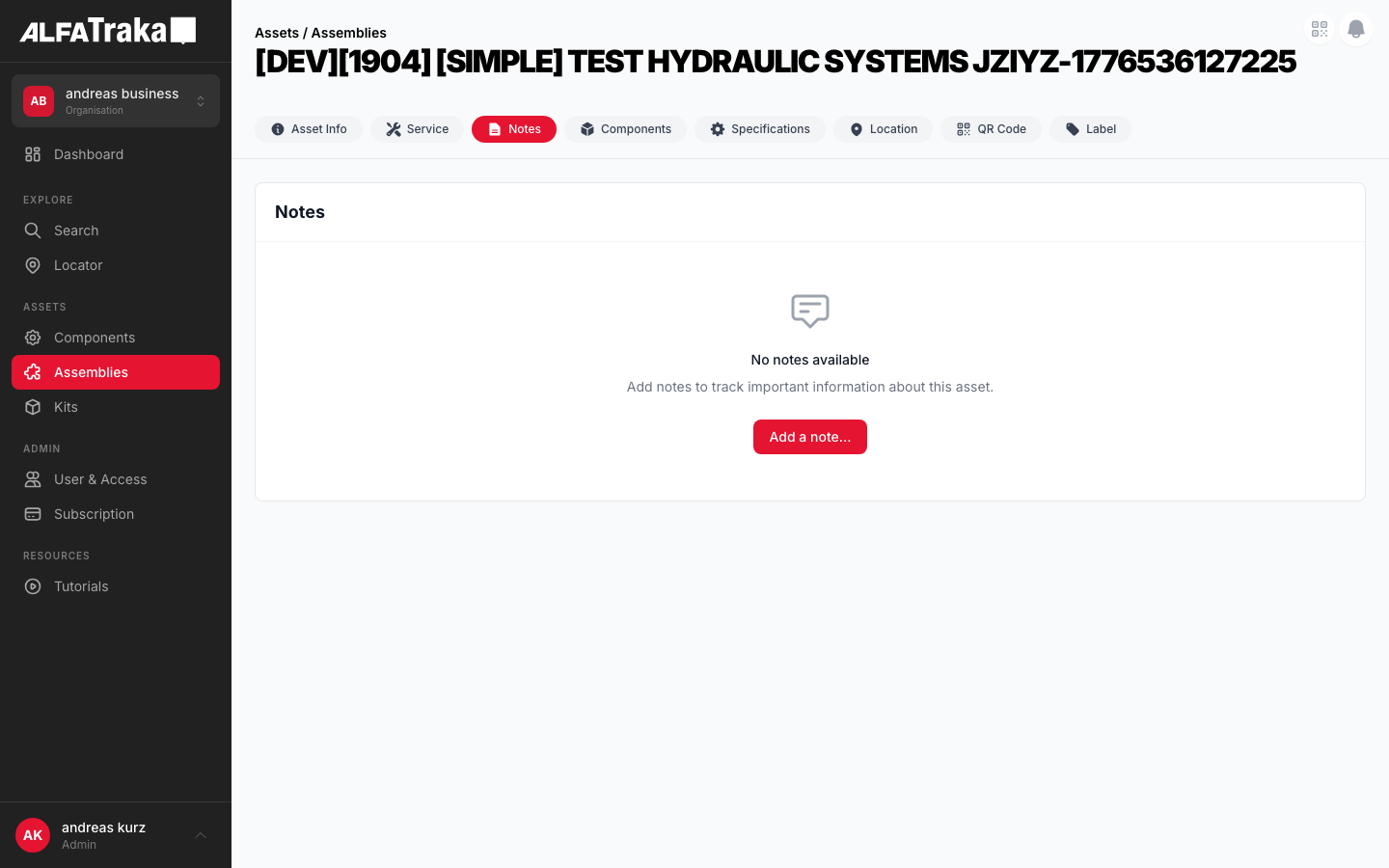
Live screenshot from dev environment (Assembly detail, Notes tab)
2. Component Tree
Assembly [id].tsx                   pages/assemblies/[id].tsx
 |- AssetDetailTabs                  components/asset-detail-tabs/index.tsx
 |   '- tab: "Notes"
 '- NotesTabLayout                   components/notes-tab-layout/index.tsx
     props: notes, canManageNotes, showAddNoteModal, ...
     |- (notes.length === 0)
     |   |- EmptyState               components/empty-state/index.tsx
     |   |   props: cardTitle="Notes", icon, title, actionLabel
     |   '- Notes (hidden, modal only)
     |- (notes.length > 0) flex row
     |   |- LEFT (flex-1): card
     |   |   |- Card Header: "Notes" + "Add Note" button
     |   |   '- Notes               components/notes/index.tsx
     |   |       '- SharedNotesSection components/shared-notes-section/index.tsx
     |   |           props: useModal=true, addNoteModalOpen, ...
     |   |           |- Add Note Modal (portal to body)
     |   |           |   |- textarea (autoFocus)
     |   |           |   |- "Add Attachments" button
     |   |           |   |- file list (removable)
     |   |           |   '- Cancel / Add buttons
     |   |           '- children: NoteItem[]
     |   |               |- NoteItem components/note-item/index.tsx
     |   |               |   |- avatar (initials, rounded-full)
     |   |               |   |- header: name + date + relative time
     |   |               |   |- actions (hover): edit, attach, delete
     |   |               |   |- note text (or edit textarea)
     |   |               |   '- attachment chips[]
     |   |               '- ...more NoteItems
     |   '- RIGHT (w-80, lg:block)
     |       '- AttachmentPreviewPanel components/attachment-preview-panel/index.tsx
     |           |- preview area (image/pdf/file)
     |           '- attachment list (scrollable, clickable)
3. Design Tokens
| Element | Tailwind Classes |
|---|---|
| Split layout | flex flex-col gap-4 lg:flex-rowHeight: style="height: calc(100vh - 200px)" |
| Notes card (left) | flex min-w-0 flex-1 flex-col overflow-hidden rounded-lg border border-gray-200 bg-white |
| Card header | flex items-center justify-between border-b border-gray-100 px-5 py-4 |
| Card header title | text-lg font-bold text-gray-900 |
| Add Note button | bg-ag_red hover:bg-ag_red/90 inline-flex items-center gap-1.5 rounded-lg px-3 py-1.5 text-sm font-medium text-white |
| Avatar (initials) | flex h-8 w-8 flex-shrink-0 items-center justify-center rounded-full bg-gray-200 text-xs font-bold text-gray-600 |
| Creator name | font-semibold text-gray-900 (within text-sm container) |
| Timestamp | text-xs text-gray-400 Relative: text-[10px] text-gray-300 |
| Note text | mt-1 whitespace-pre-line text-sm text-gray-700 |
| Attachment chip | inline-flex items-center gap-1 rounded-md border border-gray-200 bg-gray-50 px-2 py-1 text-xs text-gray-600 hover:border-gray-300 hover:bg-gray-100 |
| Hover actions | flex items-center gap-1 opacity-0 transition group-hover:opacity-100Each button: rounded p-1 text-gray-400 hover:bg-gray-100 hover:text-gray-600 |
| Note divider | group border-b border-gray-100 py-4 first:pt-0 last:border-0 |
| Preview panel (right) | hidden w-80 flex-shrink-0 overflow-hidden rounded-lg border border-gray-200 bg-white lg:block |
| Modal overlay | fixed inset-0 z-50 flex items-center justify-center bg-black/50 |
| Modal card | w-full max-w-lg rounded-lg bg-white p-6 shadow-xl |
| Edit textarea | w-full resize-none rounded-lg border border-gray-300 bg-gray-50 p-3 text-sm text-gray-900 focus:border-ag_red focus:ring-1 focus:ring-ag_red/30 |
4. Data Fields
| Field | Type | Source Property | Notes |
|---|---|---|---|
| Note text | string | note.note | Rendered with whitespace-pre-line; editable via inline textarea |
| Creator name | string | note.creator_name or note.account.name + surname | Fallback to account object if creator_name missing |
| Initials | derived | First letter of each word in creator name | Uppercased, max 2 chars, fallback "?" |
| Created date | datetime | note.updated_at || note.created_at | Format: DD.MM.YYYY HH:mm + relative (fromNow()) |
| Attachments | array | note.attachments[] | Each has _id, filename, file_type, url |
| Creator ID | string | note.account._id or note.creator_id | Used for ownership check (edit/delete own notes only) |
Attachments support images (png, jpg, gif, webp), PDFs, videos (mp4, mov, avi), and generic documents. Max file size enforced by MAX_FILE_SIZE constant.
5. Permissions
| Action | Permission Key | Condition |
|---|---|---|
| View notes | Read{AssetType}NotesReadAssemblyNotes, ReadComponentNotes, ReadKitNotes | Tab visible only with read permission |
| Add note | Manage{AssetType}NotesManageAssemblyNotes, ManageComponentNotes, ManageKitNotes | canManageNotes prop controls Add Note button visibility |
| Edit own note | Manage{AssetType}Notes | note.account._id === userId || note.creator_id === userAgId -- only own notes |
| Delete own note | Manage{AssetType}Notes | Same ownership check as edit. Confirmation not shown (immediate delete). |
| Add attachment | Manage{AssetType}Notes | Owner-only. File picker via hidden input, validates type + size. |
| Delete attachment | Manage{AssetType}Notes | Owner-only. Per-attachment loading state tracked via Map. |
The canManageNotes boolean is derived from the permissions object in the parent page and passed down through NotesTabLayout.
6. Variants
Two-column layout: scrollable notes list on the left (flex-1), attachment preview panel on the right (w-80, hidden below lg). Each note shows avatar, name, timestamp, text, and attachment chips. Hover reveals edit/attach/delete actions for own notes.
Full-width card with EmptyState component: chat bubble icon, "No notes" title, description text, and "Add Note" CTA button (if canManageNotes). Hidden Notes component renders behind it to handle the modal.
Portal-rendered modal (createPortal to body). Contains textarea (autoFocus), "Add Attachments" button with file picker, removable file list, and Cancel/Add action buttons. Backdrop click closes when not loading.
Note text replaced by textarea with current value. Cancel and Save buttons below. Edit state is per-note (editable local state in NoteItem). Textarea uses defaultValue and ref for uncontrolled input.
Implementation Notes
- Tab visibility depends on asset type and permissions (e.g. Notes tab hidden if user lacks
Read{AssetType}Notes) - Swipe hint banner is shown once, then dismissed via
localStorage - FAB visibility depends on
Manage{AssetType}Notespermission
7. Status
8. Web Mockup
Interactive mockup of the Notes tab. Switch between variants to see each state.
Notes
Replaced the hydraulic fitting on the left side. Torque applied per manufacturer spec (45 Nm). Recommend re-inspection in 30 days.
Initial inspection complete. Assembly is within operational parameters. No defects found.
Asset received and logged into inventory. Awaiting QC inspection before deployment.
Click an attachment to preview
All Attachments (3)
Notes
No notes
Add notes to track important information about this asset.
Notes
Replaced the hydraulic fitting...
Add Note
9. Mobile Design (React Native)
Proposed native layout for the Notes tab. Single-column note list, FAB for adding notes, swipe gestures for edit/delete.
Assemblies
Swipe left on your notes to edit or delete
Replaced the hydraulic fitting on the left side. Torque applied per manufacturer spec (45 Nm).
Initial inspection complete. Assembly is within operational parameters. No defects found.
Asset received and logged into inventory. Awaiting QC inspection before deployment.
Proposed mobile layout -- single-column notes, FAB for add, swipe-to-action on own notes