Service Dates Tab
Developer guide for the Service Dates calendar and detail panel used on Assembly and Component detail pages.
1. Screenshot
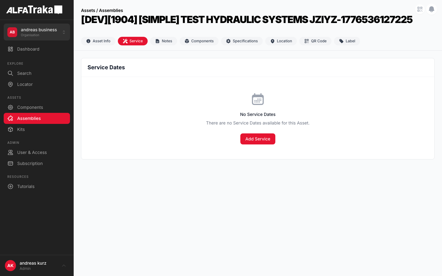
Live screenshot from dev environment (Assembly detail, Service Dates tab)
2. Component Tree
ServiceDates                         components/service-dates/index.tsx
 props: asset, assetType, serviceTypes, permissions, userAgId, serviceDates, loading, refetch
 |- [hasServiceDates = true]
 |   '- div.flex.flex-col.lg:flex-row  height: calc(100vh - 200px)
 |       |- LEFT (lg:w-1/2) — Calendar card
 |       |   '- div.rounded-lg.border.border-gray-200.bg-white
 |       |       |- Card Header: "Service Dates" + Add Service button
 |       |       '- DashboardCalendarBase    components/dashboard-calendar/index.tsx
 |       |           props: dashboardState, calendarView, setCalendarView,
 |       |                  hideMapButton, hideExpandButton, hideAssetColumn,
 |       |                  hideLocationColumn, selectedEventId, onEventClick
 |       |           |- View toggle: Day | Week | Month | List
 |       |           |- Today + Prev/Next nav
 |       |           |- MonthView             dashboard-calendar/month-view.tsx
 |       |           |- WeekView              dashboard-calendar/week-view.tsx
 |       |           |- TodayView             dashboard-calendar/today-view.tsx
 |       |           |- ListView              dashboard-calendar/list-view.tsx
 |       |           '- CalendarLegend        dashboard-calendar/legend.tsx
 |       '- RIGHT (flex-1) — Detail panel
 |           '- ServiceDateDetail
 |               |- Header: service_type_name + date + time + Edit button
 |               |- Status + Due grid (2 cols)
 |               |- Notes section (allNotes from items)
 |               |- Documents section (images + file list)
 |               '- Items section (kit multi-asset, shown when items.length > 1)
 |- [hasServiceDates = false]
 |   '- EmptyState                   components/empty-state/index.tsx
 |       props: cardTitle="Service Dates", icon=CalendarDaysIcon,
 |              title, description, actionLabel (if canManage)
 |- [assetType = 'kit']
 |   '- ServiceDates (same component as asy/comp — list + detail split)
 |       Events are kit-level (one row per SD, not per item)
 |       Detail panel appends "Associated Assets" section AFTER Documents
 |       Notes + Documents aggregate across root + items via V2 items[] naturally
 |- AddServiceModal                  components/add-service-modal/index.tsx
 '- UpdateServiceModal               components/update-service-modal/index.tsx
     props: serviceDate, fromKitId (deeplink), handleDeleteServiceDate
3. Design Tokens
| Element | Tailwind Classes |
|---|---|
| Outer layout | flex flex-col gap-4 lg:flex-row with height: calc(100vh - 200px) |
| Calendar card | flex w-full flex-shrink-0 flex-col overflow-hidden lg:w-1/2Inner: rounded-lg border border-gray-200 bg-white |
| Card header | flex items-center justify-between border-b border-gray-100 px-5 py-4 |
| Card header title | text-lg font-bold text-gray-900 |
| Add Service button | bg-ag_red hover:bg-ag_red/90 inline-flex items-center gap-1.5 rounded-lg px-3 py-1.5 text-sm font-medium text-white |
| Detail panel | flex-1 overflow-y-auto rounded-lg border border-gray-200 bg-white |
| Detail header | border-b border-gray-100 px-6 py-5 |
| Edit button (detail) | inline-flex items-center gap-1.5 rounded-lg border border-gray-200 bg-white px-3 py-1.5 text-sm font-medium text-gray-700 shadow-sm hover:bg-gray-50 |
| View toggle (active) | bg-ag_red text-white px-2.5 py-1 text-xs font-medium |
| View toggle (inactive) | text-gray-600 hover:bg-gray-50 px-2.5 py-1 text-xs font-medium |
| Selected row (list) | bg-red-50/60 border-l-2 border-l-ag_red |
| Unselected row | hover:bg-gray-50 |
| Status dot | h-1.5 w-1.5 rounded-full + color from getStatusClasses() |
| Status: Completed | Badge: bg-green-50 text-green-700 Dot: bg-emerald-500 |
| Status: Overdue | Badge: bg-red-50 text-red-700 Dot: bg-ag_red |
| Status: Scheduled | Badge: bg-blue-50 text-blue-700 Dot: bg-blue-500 |
| Status: Open | Badge: bg-gray-100 text-gray-600 Dot: bg-gray-400 |
| Notes card | rounded-lg bg-gray-50 px-3 py-2 |
| Section label | text-xs font-semibold uppercase tracking-wide text-gray-500 with icon |
| Empty state card | rounded-lg border border-gray-200 bg-white with header + p-12 text-center |
| Column split | Left: w-full lg:w-1/2 Right: flex-1 |
| Notes/docs count badge | Icon: h-3 w-3 Text: text-[10px] text-gray-400 |
4. Data Fields
Primary entity: ServiceDateV2Entity. Each service date has nested items[] (one per asset in a kit, or one for standalone).
| Field | Type | Source | Display Location |
|---|---|---|---|
| Service Type | string | sd.service_type_name | Detail header title, list view Service Type column |
| Date | number (epoch) | sd.root_date | Detail header (formatted), list view Date column |
| Start Time | number | null | sd.root_start_time | Detail header (HH:mm), list view Time column |
| End Time | number | null | sd.root_end_time | Detail header (HH:mm), list view Time column |
| Full Day | boolean | sd.root_is_full_day | Detail header ("Full day"), list view Time column |
| Status | number (enum) | sd._itemStatus ?? items[0].status | Detail Status field, list view Status column with dot |
| Due | computed | dayjs diff from today | Detail Due field ("In 5 days", "3 days ago", "Today") |
| Notes | array | items.flatMap(i => i.notes) · kit aggregates naturally via items[] | Detail Notes section (same on asy/comp/kit) |
| Documents | array | items.flatMap(i => i.documents) · kit aggregates naturally via items[] | Detail Docs section: thumbnails + file list (same on asy/comp/kit) |
| Items | array | sd.items | Renders as "Associated Assets" section in kit detail panel (after Documents) |
| is_root (derived) | boolean | item.asset_id === sd.asset_id | Root edits cascade to children (backend); non-root edits are local |
| Note association (XOR) | FK | asset_id or service_date_items_sk | Asset-level note vs service-date-item note |
| Document association (XOR) | FK | service_date_item_id or asset_note_id | Item doc vs note attachment |
| Asset ID | string (ObjectId) | sd.asset_id | Used to find relevant item for status |
| Asset Type | string | sd.asset_type | Calendar event icon, permission resolution |
Status enum: 1=Open, 2=Confirmed, 3=Completed. Overdue is a derived visual (status=1 + past due). Mapped via SERVICE_DATE_STATUS_2 from shared-layer.
5. Permissions
| Action | RIGHTKEY | Condition |
|---|---|---|
| View tab / list | ReadServiceDatesReadServiceDatesAssembly, ReadServiceDatesComponent | Tab visible only with read permission for the asset type |
| Add Service Date | ManageServiceDates{AssetType}ManageServiceDatesAssembly, ManageServiceDatesComponent | "+ Add Service" button visible only with manage permission |
| Edit Service Date | ManageServiceDates{AssetType} | "Edit" button in detail panel. Opens UpdateServiceModal. |
| Delete Service Date | ManageServiceDates{AssetType} | Inside UpdateServiceModal, confirmation required before delete |
Permission resolved via: assetType === 'component' ? permissions[RIGHTKEYS.ManageServiceDatesComponent] : permissions[RIGHTKEYS.ManageServiceDatesAssembly]
6. Variants
Split layout: calendar card (left 1/2) in List view with DashboardCalendarBase, detail panel (right 1/2) showing ServiceDateDetail. First item auto-selected. Selected row has bg-red-50/60 border-l-2 border-l-ag_red.
Calendar switches to month grid. Clicking a day navigates to Day view. Event dots shown on calendar cells. Detail panel still visible on the right.
When serviceDates.length === 0, renders shared EmptyState component with cardTitle="Service Dates", CalendarDaysIcon, and "+ Add Service" CTA (if canManage).
Right panel shows: header (service type + date/time), status/due grid, Notes section with gray cards, Documents section with image thumbnails (80x80 grid) and file list, Items section (for kits with multiple items).
URL query ?serviceDate=123 auto-selects the service date in the master–detail panel (same behaviour for assembly / component / kit). Query params are stripped after processing.
Kit uses the same list + detail layout as assembly / component. Each row in the list is one kit-level service date (not per child item). The detail panel has identical sections / element order / Edit-button placement, with one kit-specific addition: an Associated Assets section appended AFTER Documents, listing the child items of sd.items[].
Modal with: service type dropdown, date picker, start/end time inputs, full-day toggle, Save/Cancel buttons. Opens from the "+ Add Service" button or FAB.
Same modal as Assembly/Component PLUS an item selector table with checkboxes for each assembly/component in the kit. User selects which child assets receive the service date.
Modal overlay with three stacked sections: Service Details (type dropdown, date, time, full-day toggle, confirmed status), Documents (upload area, existing docs table with delete, upload button), Notes (add note textarea with file attach, existing notes list). Footer: Delete (red) + Cancel + Save. Source: components/update-service-modal/index.tsx → ServiceDetailsSection + DocumentsSection + NotesSection.
Full-screen modal (not popup). Header: "Add Service Date" + close. Scrollable form: service type dropdown, date picker, time pickers, full-day toggle, document upload section. For kits: item selector with checkboxes. Fixed footer: Cancel + Save.
Full-screen modal with pre-filled form. Same fields as add + confirmed toggle, documents section with existing docs and upload, notes section with existing notes and add note input. Fixed footer: Delete (red) + Cancel + Save.
7. Status
?serviceDate=X — selects the service date in the detail panel on any asset type8. Web Interactive Mockup
Click variant tabs to switch between states. Mockup reflects actual Tailwind classes from the codebase.
Service Dates
Service Calendar
April 2026
Pressure Test
Status
Scheduled
Due
In 4 days
Notes (1)
Pressure test scheduled per client request. Use 1.5x working pressure.
15.04.2026 14:32
Documents (0)
No documents attached
Service Dates
Service Calendar
April 2026
Service Dates
No service dates
There are no service dates scheduled for this asset yet.
Service Dates
Hydraulic Flush
Status
Completed
Due
34 days ago
Notes (2)
Flush completed successfully. No contamination detected.
15.03.2026 16:45
Used ISO 4406 cleanliness standard. Results: 16/14/11.
15.03.2026 17:02
Documents (3)
Service Dates
Service Calendar
April 2026
Pressure Test
Status
Scheduled
Due
In 4 days
Notes (3)
Pressure test scheduled per client request. Use 1.5x working pressure.
15.04.2026 14:32
Torque wrench calibrated before the job. Cert expires May 2026.
18.04.2026 08:05
Flange bolts re-torqued to 95 Nm. Gasket replaced (part #G-2201).
18.04.2026 14:22
Documents (2)
Add Service Date
Drag & drop files here, or browse
PDF, images, documents up to 10 MB
Source: components/add-service-modal/index.tsx uses DocumentsSection
Add Service Date (Kit)
Which assemblies / components in this kit should receive this service date? All selected by default.
| Asset | Type | |
|---|---|---|
|
IMG
2" Gate Valve
|
Assembly | |
|
IMG
Hydraulic Hose 3/4"
|
Component | |
|
IMG
Pressure Gauge 0-600
|
Component |
Edit Service Date
Service Details
Documents (2)
Drag & drop or browse
| Name | Updated At | Type | |
|---|---|---|---|
| test-certificate.pdf | 15.04.2026 | application/pdf | |
| inspection-photo.jpg | 15.04.2026 | image/jpeg |
Notes (1)
Pressure test scheduled per client request. Use 1.5x working pressure.
Components: UpdateServiceModal → ServiceDetailsSection + DocumentsSection + NotesSection | Source: components/update-service-modal/index.tsx
9. Mobile Design (React Native)
Proposed native layout for Service Dates. Card list with bottom sheet detail, FAB for adding. Variant switcher below.
Assemblies
2" Gate Valve
Tab visibility depends on asset type and permissions
In 42 days
Proposed mobile layout -- card list with bottom sheet detail, FAB opens Add Service modal directly (no context menu). Kit variants mirror the asy/comp layout with one addition: an Associated Assets section inserted after Documents in the bottom sheet (AB#94913).