Specifications Tab
Developer guide for the Specifications panel used on Assembly and Component detail pages. Covers spec grouping, auto-derived fields, edit mode, and the Crimping section.
1. Screenshot
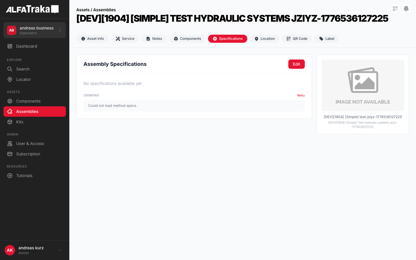
Live screenshot from dev environment (Assembly detail, Specifications tab)
2. Component Tree
Assembly [id].tsx                       pages/assemblies/[id].tsx
 |- PageHeader
 |- AssetDetailTabs
 |   '- tab navigation (Info | Specs | Components | Service)
 '- SpecificationAssembly               components/specification-assembly/index.tsx
     props: assembly, isEdit, setIsEdit, permissions, setAssembly, isDisplaySpecs
     |- Card Header: title + Edit/Save/Cancel buttons
     |- SpecSection "General"            components/spec-field/index.tsx (SpecSection)
     |   '- SpecField (x N)             components/spec-field/index.tsx
     |       props: label, value, unit, derived, highlight, editable, onChange
     |- SpecSection "Ends & Retention"
     |   '- SpecField (x N)
     |- SpecSection "Additional"
     |   '- SpecField (x N)
     |- SpecSection "Other"
     |   '- SpecField (x N)
     '- CrimpingSection                  components/specification-assembly/index.tsx (internal)
         props: assemblyId
         '- SpecSection "Crimping"
             badge: Crimp | Field-Attachable | Clamped
             '- SpecField (crimp params)

Component [id].tsx                      pages/components/[id].tsx
 '- SpecificationComponent              components/specification-component/index.tsx
     props: component, isEdit, setIsEdit, permissions, setComponent, isDisplaySpecs
     |- SpecSection "Dimensions"
     |   '- SpecField (x N)
     |- SpecSection "Pressure & Performance"
     |   '- SpecField (x N)
     '- SpecSection "Other"
         '- SpecField (x N)
3. Design Tokens
| Element | Tailwind Classes |
|---|---|
| Card container | rounded-lg border bg-whiteView: border-gray-200 Edit: border-2 border-ag_red/30 |
| Card header | flex items-center justify-between border-b border-gray-100 px-6 py-4 |
| Card header title | text-lg font-bold text-gray-900 |
| Field row (view) | flex items-center justify-between rounded-lg bg-gray-50 px-4 py-2.5Label: text-xs text-gray-600 Value: text-xs font-medium text-gray-900 |
| Field row (highlight) | bg-amber-50/50Label: text-xs font-medium text-gray-900 Value: text-sm font-bold text-gray-900 |
| Field row (edit) | flex items-center justify-between rounded-lg border border-gray-200 bg-white px-4 py-2Input: w-40 rounded border border-gray-200 px-2 py-1 text-right text-xs text-gray-900 focus:border-ag_red focus:ring-1 focus:ring-ag_red |
| Auto badge (derived) | rounded bg-green-50 px-1.5 py-0.5 text-[9px] font-medium text-green-600 |
| Section header | text-[10px] font-semibold uppercase tracking-wider text-gray-400 |
| Section subtitle | text-[10px] text-gray-300 (e.g., "- editable" / "- read-only") |
| Crimp badge | rounded-full px-2 py-0.5 text-[9px] font-medium uppercaseCrimp: bg-red-50 text-ag_red Clamped: bg-green-50 text-green-700 FA: bg-blue-50 text-blue-700 |
| Editing badge | rounded bg-blue-50 px-2 py-0.5 text-[10px] font-medium text-blue-600 |
| Edit button | bg-ag_red hover:bg-ag_red/90 rounded-lg px-4 py-1.5 text-sm font-medium text-white |
| Cancel button | rounded-lg border border-gray-200 px-4 py-1.5 text-sm font-medium text-gray-600 hover:bg-gray-50 |
| Section gap | space-y-6 between sections, space-y-1 between rows |
| Image panel | rounded-lg border border-gray-200 bg-white p-4 |
4. Spec Grouping
Specs are grouped by normalized key matching. Each spec's name is lowercased and stripped of non-alphanumeric chars, then matched against key sets.
Assembly Groups
| Group | Normalized Keys | Editable in Edit Mode |
|---|---|---|
| General | nominalbore, workingpressurebar, workingpressurepsi, workingpressurempa, burstpressurebar, overalllengthmm, calccutlength | No (auto-derived) |
| Ends & Retention | end1, end2, retention1, retention2 | No (auto-derived) |
| Additional | orientation1, orientation2, drawingreference, protection, cleaning, packaging, markingtext | Yes |
| Other | Any key not in the above sets | Yes |
Component Groups
| Group | Normalized Keys | Editable in Edit Mode |
|---|---|---|
| Dimensions | idhosemm, odhosemm, idferrulemm, odferrulemm, ferrulelength, ferrulelengthmm, cutoffmm, idhoseindfit, idhoseindfitmm | Yes (all editable) |
| Pressure & Performance | workpressurebar, workpressurepsi, workpressurempa, burstpressurebar, burstpressurepsi, hwpbar, hwppsi | Yes |
| Other | Any key not in the above sets | Yes |
Note: Assembly specs use AUTO_DERIVED_KEYS to mark certain fields as read-only even in edit mode (green "Auto" badge). Component specs have no auto-derived keys -- all fields are editable.
5. Permissions
| Action | RIGHTKEY | Condition |
|---|---|---|
| View specs | -- | Always visible when specs tab is shown |
| Enter edit mode | ManageAssemblySpecifications / ManageComponentSpecifications | Button disabled without permission. Only shown when asset.is_custom === true. |
| Save specs | Same as above | Disabled if no changes detected (isChanged memo) or save in progress |
The Edit button is only rendered when is_custom is true. Non-custom assets from the catalog have no edit capability.
6. Variants
Grouped spec fields (General, Ends & Retention, Additional, Other) in read-only gray rows. Auto-derived fields show green "Auto" badge. Card border is border-gray-200.
Card border changes to border-2 border-ag_red/30. Blue "Editing" badge appears next to title. Non-derived fields become editable inputs. Section headers show "- editable" or "- read-only" subtitle. Save/Cancel replace Edit button.
Uses different grouping (Dimensions, Pressure & Performance, Other). No auto-derived keys -- all fields are editable in edit mode. No Crimping section.
When isDisplaySpecs is false and not in edit mode, shows "No specifications available yet" message in text-sm text-gray-400.
Crimp Diameter and similar critical values use bg-amber-50/50 background with bold value text. Applied via the highlight prop on SpecField.
7. Crimping Section
The CrimpingSection is an internal component within specification-assembly. It fetches method specs from the API and renders crimp parameters when the assembly method is "crimp".
| Field | Source | Highlighted |
|---|---|---|
| Crimp Table | crimp.crimptable.name | No |
| Style | crimp.crimptable.style (string or nested object) | No |
| Crimp Diameter | master.crimp_diameter + " mm" | Yes (amber) |
| Min Mark | master.min_mark | No |
| Type | crimp.crimptable.type | No |
| Die Set | master.die_set | No |
When is_symmetric is true, renders a single list of crimp params. Badge color: red.
When is_symmetric is false, renders Side A and Side B sub-headers (text-[9px] font-medium text-gray-400) with separate crimp params for each side.
Shows spinner (h-4 w-4 animate-spin rounded-full border-2 border-gray-200 border-t-ag_red) with "Loading..." text in bg-gray-50 row.
Shows "Could not load method specs." message with a red "Retry" link (text-ag_red text-[10px] font-medium hover:underline) in the section header actions.
8. Status
Proposed native layout for the Specifications tab. Same data model and grouping, adapted for single-column touch interaction.
Assemblies
General
Ends & Retention
Crimping
CRIMPAdditional
Proposed mobile layout -- same spec grouping, single-column scroll, crimp badge inline
9. Web Interactive Mockups
Interactive mockups of the Specifications panel as rendered on web. Use the switcher to toggle between variants.
Auto Badge Visibility
- Wizard assembly (has
sidesdata): Auto badges shown on derived fields (nominalbore, workingpressure*, burstpressure*, overalllengthmm, calccutlength, end1, end2, retention1, retention2). - Legacy custom assembly (no
sidesdata): No Auto badges -- all fields are manually editable. The mockup below shows the wizard variant.
Assembly Specifications
General
Ends & Retention
Additional
Crimping
CrimpAssembly Image
10. Mobile Interactive Mockups
Interactive mockups of the Specifications panel as rendered on mobile (iPhone frame). Use the switcher to toggle between variants.
Assemblies
General
Ends & Retention
Crimping
CrimpAdditional
Mobile mockups -- single-column layout, no image panel, touch-optimized spec rows